|
|
 |
|

07-18-2014, 08:49 PM
|
|
Brigadier General
|
|
Join Date: Apr 2001
Posts: 2,467
Thanks: 208
Thanked 1,020 Times in 479 Posts
|
|
Originally Posted by Fudd

Is there such a thing? Is there a logo that can be proven in some empirical way to be a superior logo to another? What is the criteria? Is there a type of flower that is clearly the most beautiful also?
This whole hubub is making me lose my faith in humanity.
|
Fudd---there are a lot of things in the world that could make you lose faith in humanity. But a logo shouldn't be one of them. I am merely pointing out that the very thing people think might have helped us arrive at a better logo are quite possibly the thing that had us arrive at this logo. There is much we don't know about the process. And in the end, yes, it is a highly subjective topic. But the best creative endeavors are never focus grouped. It takes courage to introduce something new into the world. And focus groups reward familiarity.
Posted via Mobile Device
|
|
Mad Props to Flyer'95 For This Totally Excellent Post:
|
|
07-18-2014, 09:42 PM
|
|
Colonel
|
|
Join Date: Nov 2007
Posts: 1,782
Thanks: 796
Thanked 604 Times in 335 Posts
|
|
Originally Posted by DetroitFlyer
No worries then that schools we compete against will not see it and exploit it....")
|
And a self-fulfilling prophecy we shall have.
|
07-18-2014, 10:04 PM
|
|
Major
|
|
Join Date: Mar 2007
Location: Oakwood, OH
Posts: 551
Thanks: 107
Thanked 390 Times in 172 Posts
|
|
|
The new logo has been revealed ...
And it's ugly as sin. The "wing" makes it look like it says VD. Not exactly the kind of "fast" the designers were aiming for, I'm sure. I will not buy or display anything with this logo on it.
http://www.daytonflyers.com/
I usually say, Every day is a great day to be a Flyer, but not today.
UD (not VD) 82 
|
07-18-2014, 10:12 PM
|
|
Major
|
|
Join Date: Mar 2007
Location: Oakwood, OH
Posts: 551
Thanks: 107
Thanked 390 Times in 172 Posts
|
|
Originally Posted by Gem City
Back in 1993/ 1994 when UD dumped the Columbia blue for that "ordinary" blue, you would have thought they just closed the university. The older alumni were freaking out and very upset.
Today, UD dumps the "ordinary" blue for navy blue and no one says a word. Personally, they should have moved to a navy blue 20 years ago.
|
I totally disagree. I don't like the logo or the uniforms. The colors aren't right (even the red seems off to me now), and that wing looks like a V. "We are (clap, clap) UD!"
|
07-18-2014, 10:49 PM
|
|
Academy Doolie
|
|
Join Date: Feb 2009
Location: Fort Wright, KY
Posts: 33
Thanks: 18
Thanked 12 Times in 9 Posts
|
|
|
Disagree with all. Search UD and you get Delaware Dallas Detroit Denver. We know UD but no one else ever did. Let it go.
Posted via Mobile Device
|
07-18-2014, 11:12 PM
|
 |
General
|
|
Join Date: Aug 2005
Location: Long Island NY
Posts: 7,178
Thanks: 31,882
Thanked 1,269 Times in 787 Posts
|
|
Originally Posted by NorthwestFlyer
Huge stretch to make that shape into a V. It does not show up in my mind.
As far as the wing, I find it kind of classic, but a little simplified. I still think a little symmetry would work to complete the wings on both sides.
Take a look at this aviator badge link. Should become clear what they were going on. At least it was what first came to my mind, certainly not a V.
http://en.wikipedia.org/wiki/Aviator_badge
My opinion on the UD vs. Dayton. When people ask me where I went to school, and I say UD, some know the school, some don't. Whenever I say Dayton, they ask about Ohio and if the Airforce Museum is worth seeing. Therefore, I think the Dayton brand is a better brand for recognition.
I am not in marketing or graphic design, BTW.
|
This pretty much reflects my opinion. I can see the VD when attention is drawn to it but dont' think that will the dominant and lasting opinion or viewpoint.
Looks great on hats and helmets. I like it.
Not 100% but it's better than what we have had by far. Suggests movement or energy, great colors and some good elements to it.
I give it 87 out of 100.

|
07-18-2014, 11:16 PM
|
|
General
|
|
Join Date: Aug 2005
Location: Long Island NY
Posts: 7,178
Thanks: 31,882
Thanked 1,269 Times in 787 Posts
|
|
Perhaps they should have closed the D down on one side , so there is less or no gap there. I have more issue with the D , than the V 
STill not bad. BUT Who is to say they may not fix or tighten it up somehow in a year if there is a lot of bad energy surrounding how it plays in the marketing end?
Funny how in some mediums and backgrounds it looks pretty **** good. ON others the V is more prevalent.
Last edited by Flyer 86; 07-21-2014 at 08:21 PM..
|
07-18-2014, 11:30 PM
|
|
Major
|
|
Join Date: Mar 2007
Location: Oakwood, OH
Posts: 551
Thanks: 107
Thanked 390 Times in 172 Posts
|
|
|
The subtle U
Originally Posted by The Worker
Did anyone see the "U" at all before being told there was a "U"?
|
I sure didn't. Still don't. 
|
07-18-2014, 11:49 PM
|
|
Major
|
|
Join Date: Mar 2007
Location: Oakwood, OH
Posts: 551
Thanks: 107
Thanked 390 Times in 172 Posts
|
|
|
New logo
Originally Posted by CraSch
I do believe I like this version better. Cleaner. Less likely to see a V see no beginning to a right side of a V (now is just a wing or half a wedge, though still Adidas-like).
|
I agree that your version is cleaner. But still, that wedge looks suspiciously like a V.
|
07-18-2014, 11:58 PM
|
|
Major
|
|
Join Date: Mar 2007
Location: Oakwood, OH
Posts: 551
Thanks: 107
Thanked 390 Times in 172 Posts
|
|
|
Yes, but ...
Originally Posted by Gem City
People that post on Facebook are not the target market. ... The only opinions that truly matter are that 15 to 20 demographic.
|
Maybe so, but it's best not to overlook the demographic that has the money now to buy lower-arena seats.
|
07-19-2014, 12:11 AM
|
|
Major
|
|
Join Date: Mar 2007
Location: Oakwood, OH
Posts: 551
Thanks: 107
Thanked 390 Times in 172 Posts
|
|
|
The video
Originally Posted by DetroitFlyer
Wow, I could feel my IQ dropping with each passing second of this video. I sure wish that koolaid could be packaged and sold. I guess I need to find some 5 year olds to better understand this manufactured excitement.
|
I had a hard time even detecting the manufactured excitement you mentioned. The video is a yawner.
|
07-19-2014, 12:54 AM
|
|
Major
|
|
Join Date: Apr 2014
Posts: 715
Thanks: 244
Thanked 824 Times in 355 Posts
|
|
Just heard that Wabler caved under intense pressure from upset Alumns.
He admitted they missed the V in the logo originally - but now that it is pointed out he says the logo must go.
They are now going with the logo choice that was the number 2 finisher from 160over90
And he assures us there is no way anyone will confuse this one with initials VD.
Below is that new logo.

|
07-19-2014, 12:55 AM
|
|
General
|
|
Join Date: Jul 2001
Location: At your high 6, in a gun WEZ
Posts: 6,913
Thanks: 3,503
Thanked 4,899 Times in 2,261 Posts
|
|
|
Meh.
How much did we pay for that anyway?
|
07-19-2014, 08:13 AM
|
|
General of the Air Force
|
|
Join Date: Feb 2009
Posts: 7,778
Thanks: 5,498
Thanked 6,255 Times in 3,097 Posts
|
|
Originally Posted by Jay O'Leary
I showed the new logo to my wife (not a UD grad) and she was not drawn to the perceived V. Rather, she saw it as striping on a plane fuselage. The less we make of it the less it is seen!
|
Funny but I showed my UD wife the logo and asked her what she thought. She immediately saw the V. Said she thought of Va Tech. She also was looking for a face profile in the D. Wanted to know why no U. I told her this was the Athletics logo. Not necessarily for the whole school. Overall she was not a fan. I guess we are a divided house. Not that that is that unusual.
|
|
Mad Props to CE80 For This Totally Excellent Post:
|
|
07-19-2014, 08:57 AM
|
 |
|
|
Join Date: Mar 2007
Location: Bluffton, SC
Posts: 22,266
Thanks: 17,648
Thanked 10,176 Times in 5,904 Posts
|
|
Originally Posted by Fudd
Is there such a thing? Is there a logo that can be proven in some empirical way to be a superior logo to another? What is the criteria? Is there a type of flower that is clearly the most beautiful also?
This whole hubub is making me lose my faith in humanity.
|
Amen Fudd. It is like judging art, because this is art. I love art museums, but I just laugh at most modern art. That is my prerogative, but it does not make me correct in any way.
I also laughed at the 98 of 100 people on facebook who did not like the logo. That is nothing more than a mob mentality. No one who likes it will post, and it is a mini-fad to hate it. Not only is it not a scientific survey, it is the exact opposite.
|
07-19-2014, 09:31 AM
|
 |
Brigadier General
|
|
Join Date: Jan 2002
Posts: 2,113
Thanks: 954
Thanked 1,752 Times in 794 Posts
|
|
Originally Posted by Go-UD-Go
Maybe so, but it's best not to overlook the demographic that has the money now to buy lower-arena seats.
|
Do you honestly think this logo will have any negative effect on lower arena ticket sales? We are D - we survived the OB years just fine.
I'd love to be a fly on the wall during the discussion in the home where logos are a factor in a $1500+ ticket purchase. The arena experience will be improved for the rest of us if someone did nix the tix because of the logo.
Posted via Mobile Device
|
|
2 UDPriders Offer Mad Props to Marysville Flyer For This Totally Excellent Post:
|
|
07-19-2014, 09:41 AM
|
|
Major General
|
|
Join Date: Jan 2009
Location: San Fernando Valley, CA
Posts: 3,285
Thanks: 1,215
Thanked 2,164 Times in 1,008 Posts
|
|
|
I showed the logo to my dog. He barked and then begin to lick himself profusely.
|
|
4 UDPriders Offer Mad Props to Buster Goode For This Totally Excellent Post:
|
|
07-19-2014, 09:56 AM
|
|
Captain
|
|
Join Date: Jan 2002
Location: Tampa
Posts: 365
Thanks: 0
Thanked 322 Times in 135 Posts
|
|
|
Guess that means he liked it!
|
|
Mad Props to soccergod For This Totally Excellent Post:
|
|
07-19-2014, 10:13 AM
|
 |
Major General
|
|
Join Date: May 2014
Location: NJ Beach Livin'
Posts: 3,238
Thanks: 1,491
Thanked 1,918 Times in 1,088 Posts
|
|
|
Dayton Daily Paper - Saturday's Edition
Sports front page story line:
" New logo earns mixed reviews"
Well it isn't quite as resounding as "THE University of Dayton"
headlines a few months ago.
The logo has been an underwhelming success so far.
Also reported that the Women's Soccer uni's will sport the new logo (not sure if their uni's will be totally in the new color scheme and design).
Next is the Men and Women's BB teams WILL sport the new uni's in November .
As far as the V; I think it's out there so be prepared to hear about VD from opponents this coming year.
Remember people be careful out there, wear protection! 
|
07-19-2014, 10:16 AM
|
|
Colonel
|
|
Join Date: Feb 2009
Location: Chicago suburbs
Posts: 1,176
Thanks: 1,661
Thanked 747 Times in 350 Posts
|
|
|
I found it humorous that Archie is wearing a shirt with the OLD UD logo (very visible)
while he is promoting the NEW logo in the you tube video
|
07-19-2014, 10:22 AM
|
|
Brigadier General
|
|
Join Date: Nov 2008
Location: Dayton
Posts: 2,024
Thanks: 8,281
Thanked 897 Times in 553 Posts
|
|
|
Maybe Marketing means dropping 'UD Flyers' in favor of D or DAYTON will be more favorably viewed and recognized by recruits. The younger set in general. I would rather signify "UD" than pay tribute to it in a vague reference inside the font. Even if they cascades a U behind the D it would be better than it is. JMO. I'm perfectly calm. I don't need people calling me names for my opinion. TIA..
|
07-19-2014, 11:30 AM
|
|
1st Lieutenant
|
|
Join Date: Jul 2007
Posts: 161
Thanks: 132
Thanked 43 Times in 23 Posts
|
|
|
Is this logo some sort of joke? It took them 18 months to come up with this BS? God only knows what they paid some artistic hack to come up with this so called design. No question a freshman Art 101 class could come up with something better. Someone did have the foresight to tell them its the UNIVERSITY of Dayton right?
|
07-19-2014, 12:32 PM
|
|
Brigadier General
|
|
Join Date: Nov 2008
Location: Dayton
Posts: 2,024
Thanks: 8,281
Thanked 897 Times in 553 Posts
|
|
|
Rollo, this thread will be such a gem for throwback thursdays three years from now. Instant classic if you ask me.. Go D! Go FLYERS!
|
|
5 UDPriders Offer Mad Props to FLYER5 For This Totally Excellent Post:
|
|
07-19-2014, 01:00 PM
|
 |
|
|
Join Date: Aug 2001
Location: RolloCon
Posts: 16,574
Thanks: 16,269
Thanked 15,915 Times in 6,996 Posts
|
|
|
I like the way the logo looks on the f'ball helmets and b'ball uniforms...and it looks good on the court if you're sitting across from the bench. But if you're in Coach's Corner or anywhere else on that side, the 'D' is unidentifiable.
At least with the old logo, you could see it was a 'UD' from any angle.
Once the season begins, I'd love to hear the impressions of the Logo from first timers to the Arena or out-of-town business people attending games that sit on the bench side...my gut say's they'll think 'WTF is that?'...and you'll see alot of the turning their heads sideways before saying...'oh yeah, now I see it'.
__________________
I shaved my balls for this?
Last edited by rollo; 07-19-2014 at 01:07 PM..
|
07-19-2014, 01:47 PM
|
|
Colonel
|
|
Join Date: Jan 2006
Posts: 1,723
Thanks: 928
Thanked 1,409 Times in 577 Posts
|
|
Originally Posted by FortWrightFlyer
Disagree with all. Search UD and you get Delaware Dallas Detroit Denver. We know UD but no one else ever did. Let it go.
Posted via Mobile Device
|
University of Denver is known as "DU".
|
07-19-2014, 02:37 PM
|
|
Brigadier General
|
|
Join Date: Jun 2001
Posts: 2,649
Thanks: 3,039
Thanked 4,000 Times in 1,176 Posts
|
|
|
Slept on it, talked to more people about it, read some nonsense on Facebook about it (sooo much whining).
Like it more today than yesterday.
Look at it this way: the new red D with the blue contrails and the "U" hidden in its lower half replaces the angled "Dayton Flyers" logo. It's an upgrade. Sharper, MUCH cleaner, distinct, recognizable. Fits better in an ESPN graphic, on a TV ticker, in a USA Today top 25 graphic. Easier to embroider on a hat, a shirt, a golf bag. It is a clear improvement over the angled wordmark. The new "D" says "Dayton Flyers" with 11 fewer letters.
Trust me, a lot of thought, time, effort, and input was put into the change. It'll grow on you. Count me as a fan.
I've said this elsewhere, but if Archie likes it, then I do too. We ought to get behind it because it is ours. And it also got us the awesome new uniform set.
Posted via Mobile Device
|
|
2 UDPriders Offer Mad Props to THirt For This Totally Excellent Post:
|
|
07-19-2014, 02:55 PM
|
|
Commander in Chief
|
|
Join Date: Jun 2005
Posts: 14,353
Thanks: 4,404
Thanked 10,618 Times in 5,097 Posts
|
|
|
I like the logo best on the dark background of our blue uniforms, like my avatar. I like symmetrical. I would have probably chosen to put it on a dark background of a bordered circle or oval to make it feel more symmetrical.
But everyone has their preference. I think it actually looks very sharp in my avatar.
Last edited by Fudd; 07-19-2014 at 03:22 PM..
|
|
2 UDPriders Offer Mad Props to Fudd For This Totally Excellent Post:
|
|
07-19-2014, 03:18 PM
|
|
|
|
Join Date: Mar 2007
Posts: 13,238
Thanks: 3,991
Thanked 4,603 Times in 2,849 Posts
|
|
|
Sensible observations,...
Originally Posted by THirt
Slept on it, talked to more people about it, read some nonsense on Facebook about it (sooo much whining).
Like it more today than yesterday.
Look at it this way: the new red D with the blue contrails and the "U" hidden in its lower half replaces the angled "Dayton Flyers" logo. It's an upgrade. Sharper, MUCH cleaner, distinct, recognizable. Fits better in an ESPN graphic, on a TV ticker, in a USA Today top 25 graphic. Easier to embroider on a hat, a shirt, a golf bag. It is a clear improvement over the angled wordmark. The new "D" says "Dayton Flyers" with 11 fewer letters.
Trust me, a lot of thought, time, effort, and input was put into the change. It'll grow on you. Count me as a fan.
I've said this elsewhere, but if Archie likes it, then I do too. We ought to get behind it because it is ours. And it also got us the awesome new uniform set.
Posted via Mobile Device
|
Originally Posted by Fudd
I like the logo best on the dark background of our blue uniforms, like my avatar.
|
Far too much emphasis placed on the logo. This change is about a major re-branding that goes far beyond the logo. Look at the men's BB uniforms. The big change is the logo- type, the color and the design. It's a very different look with the small logo on the side of the pants a small part.
As for all the "vee" discussion (BS)...when a single color is used one would not think of a "vee"....the wings are an extension of the "D". When the wings and the "D" are a different color the color change interupts the flow, so to speak, making some see a "vee". If that turns out to be a real issue after time passes, UD can simply decide never to use a logo with different color wings and "D".
As you guys suggest,...let some time pass,....let's see other sport uniforms....and how the change is branded. And for sure, TH is right: a great deal of time and effort went into this...and many alternatives were evaluated.
Let's all cool it for a while....sit back....and let the U handle the rebranding roll-out.
|
|
Mad Props to UACFlyer For This Totally Excellent Post:
|
|
07-19-2014, 03:33 PM
|
 |
|
|
Join Date: Feb 2007
Location: Dayton, OH
Posts: 13,612
Thanks: 1,854
Thanked 17,162 Times in 5,119 Posts
|
|
Originally Posted by Sit_Down_Digger
Someone did have the foresight to tell them its the UNIVERSITY of Dayton right?
|
Its also Ohio State UNIVERSITY, Syracuse UNIVERSITY, and Stanford UNIVERSITY.
What do all three of those schools have in common other than a Flyer bushwhacking?
They use a single letter in much of their branding. The "O", the "S", and the "S". Whats at the 50 yard line of each of those football programs? Whats on their uniforms? Whats in their marketing materials? Single letter logo-marks.
I think of those schools and wonder how they have survived this long misrepresenting themselves. Probably cost each of them at least one Final Four.
P.S. the UNIVERSITY of Florida uses a singular "F" too.
__________________
Hot shooting hides a multitude of sins.
"Yeah....220, 221, whatever it takes." - Jack Butler (Mr. Mom)
|
|
5 UDPriders Offer Mad Props to Chris R For This Totally Excellent Post:
|
|
07-19-2014, 03:48 PM
|
|
Colonel
|
|
Join Date: Oct 2008
Posts: 1,784
Thanks: 140
Thanked 1,145 Times in 598 Posts
|
|
Originally Posted by Fudd
I like the logo best on the dark background of our blue uniforms, like my avatar. I like symmetrical. I would have probably chosen to put it on a dark background of a bordered circle or oval to make it feel more symmetrical.
But everyone has their preference. I think it actually looks very sharp in my avatar.
|
I really like the look of that as well.
|
07-19-2014, 04:05 PM
|
 |
|
|
Join Date: Jan 2010
Posts: 22,569
Thanks: 6,799
Thanked 6,178 Times in 4,206 Posts
|
|
Originally Posted by Fudd
I like the logo best on the dark background of our blue uniforms, like my avatar.
But everyone has their preference. I think it actually looks very sharp in my avatar.
|
Agree, that looks pretty sharp, that is a different look with the wings and the D being of the same color...still not in love with the logo though, but I can live with it.
Last edited by ud2; 07-19-2014 at 04:19 PM..
|
07-19-2014, 04:46 PM
|
|
|
|
Join Date: Mar 2007
Posts: 13,238
Thanks: 3,991
Thanked 4,603 Times in 2,849 Posts
|
|
|
Wings and D
Originally Posted by ud2
Agree, that looks pretty sharp, that is a different look with the wings and the D being of the same color...
|
When the wings and D are the same color the "looK" is quite different than when both red and blue are used. With the same color there is a natural flow...a "flying D" kinda look.
When two colors are used the wings are separated from the D...that's when some see a "vee"....and the logo appears to have two distinct parts.
When branding either a school, company, sports team, etc., always there is a formal usage protocal, i.e., rules describing the "dos and don'ts". I would not be surprised if UD decides that the logo should always be a single color, e.g., all red, all blue, all black.
|
07-19-2014, 05:30 PM
|
|
Lieutenant Colonel
|
|
Join Date: Jul 2001
Posts: 835
Thanks: 226
Thanked 562 Times in 222 Posts
|
|
|
The logo is slowly growing on me.
When doing 2 colors, can they be flipped, so wing red and D blue? When against a red or blue backgound, can white or black be used? This second question is because I thought Flyer'95 rendition of colored hats with the wing in white worked. So just curious about the overall "rules" on color use.
|
07-19-2014, 06:00 PM
|
|
Lieutenant General
|
|
Join Date: Nov 2004
Posts: 4,867
Thanks: 2,939
Thanked 1,452 Times in 781 Posts
|
|
Originally Posted by Chris R
Its also Ohio State UNIVERSITY, Syracuse UNIVERSITY, and Stanford UNIVERSITY.
What do all three of those schools have in common other than a Flyer bushwhacking?
They use a single letter in much of their branding. The "O", the "S", and the "S". Whats at the 50 yard line of each of those football programs? Whats on their uniforms? Whats in their marketing materials? Single letter logo-marks.
I think of those schools and wonder how they have survived this long misrepresenting themselves. Probably cost each of them at least one Final Four.
P.S. the UNIVERSITY of Florida uses a singular "F" too.
|
Yep, reads like a roster of peer schools. I'm guessing by tomorrow our VD logo, I mean D logo will be right there with them.
|
07-19-2014, 06:31 PM
|
|
|
|
Join Date: Mar 2007
Posts: 13,238
Thanks: 3,991
Thanked 4,603 Times in 2,849 Posts
|
|
|
Peer schools....
Originally Posted by Chris R
Its also Ohio State UNIVERSITY, Syracuse UNIVERSITY, and Stanford UNIVERSITY.
What do all three of those schools have in common other than a Flyer bushwhacking?
They use a single letter in much of their branding. The "O", the "S", and the "S". Whats at the 50 yard line of each of those football programs? Whats on their uniforms? Whats in their marketing materials? Single letter logo-marks.
I think of those schools and wonder how they have survived this long misrepresenting themselves. Probably cost each of them at least one Final Four.
P.S. the UNIVERSITY of Florida uses a singular "F" too.
|
Originally Posted by DetroitFlyer
Yep, reads like a roster of peer schools. I'm guessing by tomorrow our VD logo, I mean D logo will be right there with them.
|
How about Creighton, Georgetown, St. Johns, Villanova and Xavier.....those Big East peers each use just a single letter logo, with the exception of St. Johns, of course,...they don't add a "U". Marquette does use a "U".
|
|
Mad Props to UACFlyer For This Totally Excellent Post:
|
|
07-19-2014, 08:58 PM
|
|
|
|
Join Date: Feb 2007
Location: Dayton, OH
Posts: 13,612
Thanks: 1,854
Thanked 17,162 Times in 5,119 Posts
|
|
Originally Posted by DetroitFlyer
Yep, reads like a roster of peer schools. I'm guessing by tomorrow our VD logo, I mean D logo will be right there with them.
|
Xavier UNIVERSITY uses an X.
UNIVERSITY of Cincinnati uses a C.
Is that peer enough.
__________________
Hot shooting hides a multitude of sins.
"Yeah....220, 221, whatever it takes." - Jack Butler (Mr. Mom)
|
|
Mad Props to Chris R For This Totally Excellent Post:
|
|
07-19-2014, 09:06 PM
|
|
Lieutenant General
|
|
Join Date: Nov 2004
Posts: 4,867
Thanks: 2,939
Thanked 1,452 Times in 781 Posts
|
|
Yep, that long list of Division I universities that start with"X" was a real challenge for Xavier.
|
|
Mad Props to DetroitFlyer For This Totally Excellent Post:
|
|
07-19-2014, 09:18 PM
|
|
General
|
|
Join Date: Sep 2007
Location: Between Kroger & Esther Price
Posts: 5,746
Thanks: 9,138
Thanked 4,539 Times in 2,056 Posts
|
|
Originally Posted by THirt
Slept on it, talked to more people about it, read some nonsense on Facebook about it (sooo much whining).
Like it more today than yesterday . . .
|
I posted this elsewhere:
http://www.theonion.com/articles/new...for-com,36489/
___________________
Whether your glass is half empty or half full, you still have more to drink.

|
|
Mad Props to Glen Clark For This Totally Excellent Post:
|
|
07-19-2014, 09:47 PM
|
|
|
|
Join Date: Feb 2007
Location: Dayton, OH
Posts: 13,612
Thanks: 1,854
Thanked 17,162 Times in 5,119 Posts
|
|
Originally Posted by DetroitFlyer
Yep, that long list of Division I universities that start with"X" was a real challenge for Xavier.
|
Cincinnati seems to be doing okay with just a C.
#ConnecticutClemsonCaliforniaColoradoCreightonChar lotte
__________________
Hot shooting hides a multitude of sins.
"Yeah....220, 221, whatever it takes." - Jack Butler (Mr. Mom)
|
|
Mad Props to Chris R For This Totally Excellent Post:
|
|
07-19-2014, 10:03 PM
|
|
|
|
Join Date: Mar 2007
Posts: 13,238
Thanks: 3,991
Thanked 4,603 Times in 2,849 Posts
|
|
|
The Power Schools
I just made a quick "tour" of the power conference websites which show the athletic logos of all conference members.
About half the schools use but a single letter....in the case of the Big 10, ten of the fourteen schools use only a letter.....no "U" and nothing else.
Except for the most informed sports fans, most of the logos would not be recognized outside their immediate regions....and a few would not be recognized even by knowledeable fans.
Any Prider that thinks Dayton could create a "letter" logo readily recognized outside of our locale is kidding themselves. Ironically, the logo we just dumped, "Dayton Flyers", would have the very highest national recognition for the obvious reason that both the school name and team name are spelled out in full.
Absent that, a letter logo with or without a "U" could be so neat that Priders would have an orgasm looking at it.....but would not be readily recognized outside our locale.
|
07-19-2014, 10:03 PM
|
|
Brigadier General
|
|
Join Date: Jun 2001
Posts: 2,649
Thanks: 3,039
Thanked 4,000 Times in 1,176 Posts
|
|
Originally Posted by Chris R
Cincinnati seems to be doing okay with just a C.
#ConnecticutClemsonCaliforniaColoradoCreightonChar lotte
|
Creighton also changed from the script "Jays" to a relatively boring block "C" one year ago.
Posted via Mobile Device
|
07-19-2014, 10:42 PM
|
|
|
|
Join Date: Mar 2007
Location: Bluffton, SC
Posts: 22,266
Thanks: 17,648
Thanked 10,176 Times in 5,904 Posts
|
|
|
Who refers to us as the University of Dayton? On TV it is always Dayton. I have told people for years I graduated for Dayton. Sorry Wright State, but people outside the area only know one school in Dayton.
Ohio U may be the only school that needs the U, or University.
|
07-19-2014, 10:58 PM
|
 |
General
|
|
Join Date: Nov 2002
Location: Columbus, OH
Posts: 6,602
Thanks: 5,193
Thanked 5,460 Times in 2,387 Posts
|
|
Originally Posted by Fudd
Is there such a thing? Is there a logo that can be proven in some empirical way to be a superior logo to another? What is the criteria? Is there a type of flower that is clearly the most beautiful also?
|
In that case no one should ever change a logo, no matter what. It will never be an improvement under any circumstances. Just a waste of marketing $.
I would be happy if they would just put the wings on both sides. I've never seen a one-winged bird with a disease fly very high. Two wings would make for an ok logo for me.
|
|
2 UDPriders Offer Mad Props to Gazoo For This Totally Excellent Post:
|
|
07-20-2014, 07:54 AM
|
|
|
|
Join Date: Mar 2007
Posts: 13,238
Thanks: 3,991
Thanked 4,603 Times in 2,849 Posts
|
|
|
Recall, the "other" Flyers,...
Originally Posted by Gazoo
In that case no one should ever change a logo, no matter what. It will never be an improvement under any circumstances. Just a waste of marketing $.
I would be happy if they would just put the wings on both sides. I've never seen a one-winged bird with a disease fly very high. Two wings would make for an ok logo for me.
|
As far as I know there is only one other team named the "Flyers".....Philly's NHL team. From the git-go those Flyers adopted a "one-sided" winged "P" and never modified it.
It's important, I think, that the wing in Philly's logo blends into the "P", i.e., one color,...the wing has never been a different color than the "P".
In my opinion, "UD's" new logo looks fine so long as one color is used. When the wing and the D are a different color the appearance is quite different. That's when the perception of a "v" enters the discussion. No one would mention a "V" in the single-color rendition.
|
|
Mad Props to UACFlyer For This Totally Excellent Post:
|
|
07-20-2014, 08:07 AM
|
|
Major General
|
|
Join Date: May 2014
Location: NJ Beach Livin'
Posts: 3,238
Thanks: 1,491
Thanked 1,918 Times in 1,088 Posts
|
|
Originally Posted by UACFlyer
As far as I know there is only one other team named the "Flyers".....Philly's NHL team. From the git-go those Flyers adopted a "one-sided" winged "P" and never modified it.
It's important, I think, that the wing in Philly's logo blends into the "P", i.e., one color,...the wing has never been a different color than the "P".
In my opinion, "UD's" new logo looks fine so long as one color is used. When the wing and the D are a different color the appearance is quite different. That's when the perception of a "v" enters the discussion. No one would mention a "V" in the single-color rendition.
|
There you go! I think THAT would work and eliminate most of the confusion as to what that portion of the Logo is supposed to be ..... when you have to point out to people familiar with the U but did not go to V ... er UD that it is a wing NOT a V there is a perception/question issue
Agree!
|
|
Mad Props to NJFlyr71 For This Totally Excellent Post:
|
|
07-20-2014, 10:00 AM
|
|
Brigadier General
|
|
Join Date: May 2001
Location: Troy, OH
Posts: 2,881
Thanks: 7,190
Thanked 2,477 Times in 1,111 Posts
|
|
|
When I was first saw it, I was pretty iffy about it. I wasn't wowed by it and my first thought wasn't, that sucks. Then I saw the picture with it on the court at the arena, and thought it looked awesome.
I think over time it will become well received. Any logo will have initially resulted in negativity. It's just the nature of the internet world.
By the way.......LOVE the new uniforms. Those wowed me!!! Can't wait to seem them in game action.
|
|
2 UDPriders Offer Mad Props to JimBo For This Totally Excellent Post:
|
|
07-20-2014, 11:07 AM
|
 |
Captain
|
|
Join Date: Jun 2012
Location: College Station, TX
Posts: 413
Thanks: 2,520
Thanked 403 Times in 151 Posts
|
|
|
The BIG D
Red Scare take note..."Watch out or you'll get the D" 
|
07-20-2014, 11:22 AM
|
|
Lieutenant General
|
|
Join Date: Mar 2008
Posts: 4,486
Thanks: 8,461
Thanked 6,619 Times in 2,468 Posts
|
|
|
|
07-20-2014, 01:32 PM
|
|
Academy Doolie
|
|
Join Date: Aug 2001
Location: Portland, OR
Posts: 29
Thanks: 7
Thanked 27 Times in 15 Posts
|
|
Originally Posted by Chris R
Xavier UNIVERSITY uses an X.
UNIVERSITY of Cincinnati uses a C.
Is that peer enough.
|
My initial negative reaction, unlike others, had nothing to do with the lack of a "U" or even the subtle "V". In fact, when I learned about the rebrand I was hoping we would move to just a "D" logo. I am just disappointed because my opinion of the logo is that it missed the mark. I feel it already looks dated (USFL anyone?). After years of inferior branding, this was a chance to step it up. The new branding is no doubt an improvement, but could have been so much better. Since you can't re-brand often, we are now stuck with this mediocre logo.
That being said, the logo of course is not going to change my love for the school and the program. Just like the old logo that I disliked, I will still come to have an affection for the new logo because like it or not it is now OURS. I have already moved to acceptance stage and will cheer the stupid flying D like crazy.
Additionally, I think the lack of a homerun on this is quintessential UD and part of the the underdog allure of being a Flyers fan. As much as I disliked the old logo, I kind of relished in the fact that it just added to the sting of defeat by other programs and their fans (how could this team with the ridiculous cartoonish logo be beating us?!!). That feeling will still be there when teams are watching their teams get beat by the flying VDs!
Plus I think the new unis look good and am glad the new logo is barely noticeable on them. I liked the LSU unis (which are the exact same design template as our new ones) and dig the new color schemes. I like what the university was trying to do and at least the effort to bring the brand forward. Was hoping for a homerun but am pleased with the sharp single.
|
|
2 UDPriders Offer Mad Props to HolidayFinn For This Totally Excellent Post:
|
|
07-20-2014, 01:39 PM
|
|
Colonel
|
|
Join Date: May 2001
Posts: 1,946
Thanks: 100
Thanked 616 Times in 371 Posts
|
|
My opinion is the logo is a Rorschach Test http://theinkblot.com/
You see what you want to see in it. There is no V or U in it.
That said it's a logo so I don't care. I care about winning ncaa tournament
games.
|
|
Mad Props to Furio For This Totally Excellent Post:
|
|
07-20-2014, 01:47 PM
|
|
|
|
Join Date: Jan 2010
Posts: 22,569
Thanks: 6,799
Thanked 6,178 Times in 4,206 Posts
|
|
Originally Posted by UACFlyer
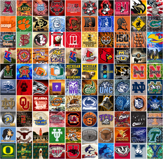
I just made a quick "tour" of the power conference websites which show the athletic logos of all conference members.
About half the schools use but a single letter....in the case of the Big 10, ten of the fourteen schools use only a letter.....no "U" and nothing else.
Except for the most informed sports fans, most of the logos would not be recognized outside their immediate regions....and a few would not be recognized even by knowledeable fans.
Any Prider that thinks Dayton could create a "letter" logo readily recognized outside of our locale is kidding themselves. Ironically, the logo we just dumped, "Dayton Flyers", would have the very highest national recognition for the obvious reason that both the school name and team name are spelled out in full.
Absent that, a letter logo with or without a "U" could be so neat that Priders would have an orgasm looking at it.....but would not be readily recognized outside our locale.
|
The logo is growing on me.
In comparison to the logos of other schools, I think that the logo is pretty good.
How many of these logos from other schools do people love? And specifically which ones do you love?

Last edited by Chris R; 07-20-2014 at 09:51 PM..
Reason: Graphics breaking forum dimensions
|
|
5 UDPriders Offer Mad Props to ud2 For This Totally Excellent Post:
|
|
07-20-2014, 02:03 PM
|
 |
Major General
|
|
Join Date: Nov 2008
Posts: 3,616
Thanks: 3,383
Thanked 3,108 Times in 1,418 Posts
|
|
Originally Posted by ud2
The logo is growing on me.
In comparison to the logos of other schools, I think that the logo is pretty good.
How many of these logos from other schools do people love? And specifically which ones do you love?
|
Very few of those logos are official athletic department logos.
EDIT: Of the top images anyway.
Last edited by Chris R; 07-20-2014 at 09:51 PM..
Reason: Graphics breaking forum dimensions
|
07-20-2014, 02:43 PM
|
|
2nd Lieutenant
|
|
Join Date: Nov 2001
Posts: 84
Thanks: 23
Thanked 80 Times in 28 Posts
|
|
|
Exactly. There are a lot of bad logos out there, and it doesn't matter at all if your team is good and the uniforms look good.
|
07-20-2014, 03:05 PM
|
|
1st Lieutenant
|
|
Join Date: Feb 2008
Location: Fort Wayne, IN
Posts: 235
Thanks: 284
Thanked 84 Times in 45 Posts
|
|
|
Logo is an unmitigated disaster!
We are UD not VD!!! 
|
|
Mad Props to chriscage For This Totally Excellent Post:
|
|
07-20-2014, 03:07 PM
|
|
|
|
Join Date: Feb 2007
Posts: 9,593
Thanks: 3,396
Thanked 6,634 Times in 3,033 Posts
|
|
|
I agree it looks much better when it is all one color. Having the "wings" in dark blue draws attention to the "V."
|
|
3 UDPriders Offer Mad Props to longtimefan For This Totally Excellent Post:
|
|
07-20-2014, 03:29 PM
|
|
|
|
Join Date: Mar 2007
Posts: 13,238
Thanks: 3,991
Thanked 4,603 Times in 2,849 Posts
|
|
|
Right on!
Originally Posted by longtimefan
I agree it looks much better when it is all one color. Having the "wings" in dark blue draws attention to the "V."
|
Correct....and the two color version breaks the flow from the D to the wings. A single color results in quite a different look.
By the way, the like/dislike poll being taken on another thread,...in which the "dislikes" currently lead,...refers to the two color version alone. It would be interesting to repeat the poll for a single color logo.
|
|
2 UDPriders Offer Mad Props to UACFlyer For This Totally Excellent Post:
|
|
07-20-2014, 04:51 PM
|
|
Colonel
|
|
Join Date: Oct 2008
Posts: 1,784
Thanks: 140
Thanked 1,145 Times in 598 Posts
|
|
Originally Posted by DetroitFlyer
Yep, reads like a roster of peer schools. I'm guessing by tomorrow our VD logo, I mean D logo will be right there with them.
|
It really doesn't matter if they are peer schools. If someone doesn't recognize an orange "S" as Syracuse, they're not going to recognize an orange "SU" as Syracuse either. Same goes for Dayton. If you can't recognize the "D" as Dayton, you're not going recognize the "UD" as Dayton either. I can understand why people prefer the "UD" but it really doesn't add anything in terms of clarity.
|
|
2 UDPriders Offer Mad Props to bcross For This Totally Excellent Post:
|
|
07-20-2014, 07:03 PM
|
|
General
|
|
Join Date: Nov 2002
Location: Columbus, OH
Posts: 6,602
Thanks: 5,193
Thanked 5,460 Times in 2,387 Posts
|
|
I think Virginia's logo is cool. And symmetrical.
|
07-20-2014, 07:12 PM
|
|
1st Lieutenant
|
|
Join Date: Dec 2008
Location: Portland, Oregon
Posts: 162
Thanks: 17
Thanked 196 Times in 68 Posts
|
|
|
I am assuming the new logo is intended to be part of the University of Dayton for a long time. The new logo needs to be altered to remove any unintended connotation, suggestion or nuance to VD. I like aspects of the logo, but time is not going to cause the overall logo to grow on me.
Last edited by nwflyer; 07-22-2014 at 12:10 AM..
|
07-20-2014, 08:36 PM
|
 |
Colonel
|
|
Join Date: Jul 2007
Location: Coldwater
Posts: 1,586
Thanks: 2,333
Thanked 1,221 Times in 549 Posts
|
|
|
How about
University of
Dayton
Flyers
Or UDF for short. Recognizable everywhere and corporate sponsorship friendly.
|
|
Mad Props to UDGutter2 For This Totally Excellent Post:
|
|
07-20-2014, 08:48 PM
|
|
Lieutenant Colonel
|
|
Join Date: Jul 2001
Posts: 835
Thanks: 226
Thanked 562 Times in 222 Posts
|
|
Originally Posted by Chris R
Once UD makes the announcement official, I will post the drawing I did of it several weeks ago in PP+ based on when I saw it. Full disclosure: I am not Picasso!
|
Well...
|
07-20-2014, 08:48 PM
|
 |
Colonel
|
|
Join Date: Mar 2007
Location: Winston Salem
Posts: 1,525
Thanks: 1,035
Thanked 841 Times in 422 Posts
|
|
|
I don't care about the logo;...I'll still read & post on vDPride.com. Great site!
WOW! (vD pride doesn't sound healthy does it?) Hold on Chris, please.
|
|
Mad Props to Flyer Gramps For This Totally Excellent Post:
|
|
07-20-2014, 08:51 PM
|
 |
|
|
Join Date: Oct 2000
Posts: 1,743
Thanks: 2,231
Thanked 2,428 Times in 829 Posts
|
|
|
Kinda funny -- if you look at the Duke logo (about as iconic as any "D" logo could be) closely enough, it could be viewed as ID. So there ya go ...
|
|
Mad Props to The Fly For This Totally Excellent Post:
|
|
07-20-2014, 09:29 PM
|
|
|
|
Join Date: Mar 2007
Posts: 13,238
Thanks: 3,991
Thanked 4,603 Times in 2,849 Posts
|
|
|
Neat!
Originally Posted by UDGutter2
How about
University of
Dayton
Flyers
Or UDF for short. Recognizable everywhere and corporate sponsorship friendly.
|
Hey, that's kinda catchy. It could be simplified a bit by dropping the "University"....just Dayton Flyers. We could use all caps, block letters,...angle the words upward from left to right.
I can almost picture it.
|
07-20-2014, 10:41 PM
|
|
Major
|
|
Join Date: Mar 2007
Posts: 619
Thanks: 1,079
Thanked 587 Times in 260 Posts
|
|
Originally Posted by HolidayFinn
If they cleaned up the left side of the D, they would lose the Conan O'Brien profile I just noticed, which so far is my favorite part of the new logo

|
At first I thought this was just a quirky joke. I didn't see it. When scrolling back through Conan's face jumped out at me. Now I somehow see the "face" more clearly than the "v" when I look at the logo. Hilarious observation!
|
|
4 UDPriders Offer Mad Props to superfan99 For This Totally Excellent Post:
|
|
07-20-2014, 11:40 PM
|
 |
Captain
|
|
Join Date: Dec 2005
Location: Dayton / Florida
Posts: 295
Thanks: 30
Thanked 199 Times in 77 Posts
|
|
|
How many VD items will be sold? I wish UD well trying to sell them.
|
07-21-2014, 07:36 AM
|
|
|
|
Join Date: Aug 2001
Location: RolloCon
Posts: 16,574
Thanks: 16,269
Thanked 15,915 Times in 6,996 Posts
|
|
Originally Posted by ud2
some/many are choosing to stay neutral.
|
Since none of us know what went on behind the scenes with respect to money and time spent, focus groups, etc...on the new logo, let's just do what we do with our players...not care.
Trust Archie and Wabler's judgment....accept the logo...warts and all...it's the Marianist way!
__________________
I shaved my balls for this?
|
07-21-2014, 08:21 AM
|
 |
I Am A Statistical God
|
|
Join Date: Mar 2008
Location: Riverside, Ohio
Posts: 5,512
Thanks: 4,692
Thanked 6,172 Times in 2,321 Posts
|
|
Originally Posted by Chris R
Its also Ohio State UNIVERSITY, Syracuse UNIVERSITY, and Stanford UNIVERSITY.
What do all three of those schools have in common other than a Flyer bushwhacking?
They use a single letter in much of their branding. The "O", the "S", and the "S". Whats at the 50 yard line of each of those football programs? Whats on their uniforms? Whats in their marketing materials? Single letter logo-marks.
I think of those schools and wonder how they have survived this long misrepresenting themselves. Probably cost each of them at least one Final Four.
P.S. the UNIVERSITY of Florida uses a singular "F" too.
|
Originally Posted by Chris R
Xavier UNIVERSITY uses an X.
UNIVERSITY of Cincinnati uses a C.
Is that peer enough.
|
Originally Posted by Chris R
Cincinnati seems to be doing okay with just a C.
#ConnecticutClemsonCaliforniaColoradoCreightonChar lotte
|
I get what you're saying Chris, but the fact is that those schools don't have a change that include the "University" side of their names. Don't think I've heard the following chants: "We are ... X ... U.", "We are ... S U", "We are ... U C", "We are ... U F", or "We are .... Tofu!" (editorial bias). Heck, at OSU games, they teach themselves how to spell Ohio, like they didn't learn that in Grade School.
So, sure, a single letter logo would be fine, but we have to be recognizable one step further than the rest. Because we aren't Syracuse, Duke, or Xavier. We are, UD! And we don't get the respect that the others do, at least now yet.
And if we become a national name regularly going forward, it may not matter that we are VD now, but, we don't know what will happen going forward. We could easily go the BG way and have no more success, or be striving for a home game in the NIT, or go the JOB way, and become the doormat of the A10.
"Show me...the money!"
|
|
2 UDPriders Offer Mad Props to Figgie123 For This Totally Excellent Post:
|
|
07-21-2014, 08:38 AM
|
 |
|
|
Join Date: Dec 2008
Location: California
Posts: 3,103
Thanks: 4,298
Thanked 2,862 Times in 1,139 Posts
|
|
|
The recruits and players like the new uniforms and logos -- they have been gushing about both on social media. The branding is for perspective students and student-athletes.
I am glad the Dayton Administration does not care about what 40+ year old alums like me think. i will wear Dayton gear whatever the logo is (except I cannot bring myself to wear any flat billed hats as I look ridiculous in them).
|
|
4 UDPriders Offer Mad Props to ruechalgrin For This Totally Excellent Post:
|
|
07-21-2014, 09:54 AM
|
|
|
|
Join Date: Aug 2001
Location: RolloCon
Posts: 16,574
Thanks: 16,269
Thanked 15,915 Times in 6,996 Posts
|
|
|
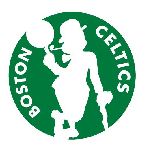
Celtics new 'lucky' logo
__________________
I shaved my balls for this?
|
07-21-2014, 02:33 PM
|
 |
Major
|
|
Join Date: Apr 2007
Location: Dayton, OH
Posts: 533
Thanks: 292
Thanked 388 Times in 157 Posts
|
|
Originally Posted by ruechalgrin
i will wear Dayton gear whatever the logo is (except I cannot bring myself to wear any flat billed hats as I look ridiculous in them).
|
It's not just you. I have yet to see any man who doesn't look ridiculous in flat billed hats. I'd say ANYONE but there's probably some incredibly hot woman wearing one somewhere...
|
07-21-2014, 03:00 PM
|
|
1st Lieutenant
|
|
Join Date: Dec 2008
Location: Portland, Oregon
Posts: 162
Thanks: 17
Thanked 196 Times in 68 Posts
|
|
Originally Posted by rollo
Trust Archie and Wabler's judgment....accept the logo...warts and all...it's the Marianist way!
|
I agree that it is not the Marianist way to throw stones at those who participated in creation of the logo and who had only good intentions. I am probably guilty of overly negative comments and for that I apologize.
However, I don't think the Marianist response to a potential oversight is sticking your head in the sand. The University should understand the concerns being raised by now. I understand that a big investment has been made. On the other hand, I am sure the University plans to have this logo in place for a long time. If the logo is going the be altered to address an oversight, better now than later.
|
|
2 UDPriders Offer Mad Props to nwflyer For This Totally Excellent Post:
|
|
07-21-2014, 03:06 PM
|
|
|
|
Join Date: Aug 2001
Location: RolloCon
Posts: 16,574
Thanks: 16,269
Thanked 15,915 Times in 6,996 Posts
|
|
|
close enough
__________________
I shaved my balls for this?
|
07-21-2014, 03:21 PM
|
|
Colonel
|
|
Join Date: Oct 2008
Posts: 1,784
Thanks: 140
Thanked 1,145 Times in 598 Posts
|
|
Originally Posted by Figgie123
I get what you're saying Chris, but the fact is that those schools don't have a change that include the "University" side of their names. Don't think I've heard the following chants: "We are ... X ... U.", "We are ... S U", "We are ... U C", "We are ... U F", or "We are .... Tofu!" (editorial bias). Heck, at OSU games, they teach themselves how to spell Ohio, like they didn't learn that in Grade School.
So, sure, a single letter logo would be fine, but we have to be recognizable one step further than the rest. Because we aren't Syracuse, Duke, or Xavier. We are, UD! And we don't get the respect that the others do, at least now yet.
And if we become a national name regularly going forward, it may not matter that we are VD now, but, we don't know what will happen going forward. We could easily go the BG way and have no more success, or be striving for a home game in the NIT, or go the JOB way, and become the doormat of the A10.
"Show me...the money!"
|
Cincinnati has that annoying UC chant.
To whom is the "UD" logo more recognizable? Outside of Ohio, were just Dayton, not UD. If someone doesn't recognize the "D" as Dayton, they're still going to get tripped up on the D if it said "UD".
|
|
Mad Props to bcross For This Totally Excellent Post:
|
|
07-21-2014, 03:55 PM
|
|
Lieutenant Colonel
|
|
Join Date: Jul 2001
Posts: 835
Thanks: 226
Thanked 562 Times in 222 Posts
|
|
Says the name is "Lucky the Leprechaun". So is General Mills the marketing sponsor, since the REAL "Lucky the Leprechaun" promotes a wonderful cereal that is "magically delicious". I'm in my upper 40's and I still love Lucky Charms!!!!
|
07-21-2014, 04:09 PM
|
 |
Lieutenant General
|
|
Join Date: Mar 2006
Posts: 4,424
Thanks: 65
Thanked 1,563 Times in 944 Posts
|
|
|
The logo looks like the perfect bottle opener- with the center of the D being the business end.
Posted via Mobile Device
|
|
Mad Props to maddog07 For This Totally Excellent Post:
|
|
07-22-2014, 08:32 AM
|
 |
Major General
|
|
Join Date: Dec 2002
Location: Miamisburg OH
Posts: 3,711
Thanks: 2,162
Thanked 2,118 Times in 1,054 Posts
|
|
|
In Defense of the New Logo
The University of Dayton's "Athletic Department Officials" were quoted in today's DDN as saying "They are happy with the new logo, which is more in line with what the college sports market demands." This change is being driven by external marketing decisions more than anything else. It is quite interesting to me that an American Catholic university is so greatly influenced by "Pop Culture".
|
07-22-2014, 09:11 AM
|
|
Lieutenant General
|
|
Join Date: Nov 2004
Posts: 4,867
Thanks: 2,939
Thanked 1,452 Times in 781 Posts
|
|
Originally Posted by Alberto Strasse
The University of Dayton's "Athletic Department Officials" were quoted in today's DDN as saying "They are happy with the new logo, which is more in line with what the college sports market demands." This change is being driven by external marketing decisions more than anything else. It is quite interesting to me that an American Catholic university is so greatly influenced by "Pop Culture".
|
Sad but not surprising. The fossil fuel nonsense was also driven by this pop culture mentality.
|
07-22-2014, 12:10 PM
|
|
|
|
Join Date: Feb 2007
Location: Dayton, OH
Posts: 13,612
Thanks: 1,854
Thanked 17,162 Times in 5,119 Posts
|
|
|
Nobody outside of Ohio has ever known what "UD" means when I say I went to UD. Nobody. In fact, whenever I drive the 911 90% of the people think the plates stand for (U)nited (D)airy Pride. And thats IN Ohio.
__________________
Hot shooting hides a multitude of sins.
"Yeah....220, 221, whatever it takes." - Jack Butler (Mr. Mom)
|
|
4 UDPriders Offer Mad Props to Chris R For This Totally Excellent Post:
|
|
07-22-2014, 12:15 PM
|
|
Lieutenant General
|
|
Join Date: Nov 2004
Posts: 4,867
Thanks: 2,939
Thanked 1,452 Times in 781 Posts
|
|
Originally Posted by Chris R
Nobody outside of Ohio has ever. known what "UD" means when I say I went to UD. Nobody. In fact, whenever I drive the 911 90% of the people think the plates stand for (U)nited (D)airy Pride. And thats IN Ohio.
|
Well, once VD catches on that problem will be solved. Now I understand the strategy....
|
07-22-2014, 01:49 PM
|
|
Brigadier General
|
|
Join Date: Mar 2008
Location: Chicago
Posts: 2,345
Thanks: 469
Thanked 1,629 Times in 765 Posts
|
|
|
Is there a way we can blame this on BG or Huelsman?
|
07-22-2014, 01:56 PM
|
|
General of the Air Force
|
|
Join Date: Feb 2009
Posts: 7,778
Thanks: 5,498
Thanked 6,255 Times in 3,097 Posts
|
|
Originally Posted by CoffeeCan
Is there a way we can blame this on BG or Huelsman?
|
No but if we don't get in the Big East in the future, it will because of the logo.
Posted via Mobile Device
|
|
6 UDPriders Offer Mad Props to CE80 For This Totally Excellent Post:
|
|
07-22-2014, 02:06 PM
|
|
|
|
Join Date: Mar 2007
Posts: 13,238
Thanks: 3,991
Thanked 4,603 Times in 2,849 Posts
|
|
|
Recognition
Originally Posted by bcross
....To whom is the "UD" logo more recognizable? Outside of Ohio, were just Dayton, not UD. If someone doesn't recognize the "D" as Dayton, they're still going to get tripped up on the D if it said "UD".
|
My guess is that, with the exception of ND, no more than a few schools using a single letter logo are recognized outside there locales.
Ohio State is big time in every way and very, very well known. But, put that "O" logo on a cap and leave the mid-west region close to Ohio and there will be essentially no connection made with tOSU. Knowing the scarlet and grey colors of OSU, a very knowledgeable sports fan is likely to make the connection; but no one else.
And Dayton is not tOSU. The typical person I encounter in the east is likely to say, "I didn't know Dayton had a university"....and those are the people that have heard of the city of Dayton!
UD has many thousands of alums living in the northeast, NY, NJ, eastern PA, etc. But, among the tens of millions of people that live there they are lost. Nothing UD could possibly do in the way of a logo design would result in recognition beyound 100-200 miles, or so, from Dayton.....except perhaps a logo spelling out "Dayton Flyers".
|
|
2 UDPriders Offer Mad Props to UACFlyer For This Totally Excellent Post:
|
|
07-22-2014, 02:58 PM
|
 |
Brigadier General
|
|
Join Date: Dec 2008
Location: Dayton, Ohio
Posts: 2,086
Thanks: 768
Thanked 2,029 Times in 766 Posts
|
|
Originally Posted by CoffeeCan
Is there a way we can blame this on BG or Huelsman?
|
I was thinking more like JOB. People blamed him for 20 years of mediocrity. His spirit may now be released. The new logo is now the whipping boy and can be blamed for all future losses and bad events.
|
07-22-2014, 03:30 PM
|
|
I Am A Statistical God
|
|
Join Date: Mar 2008
Location: Riverside, Ohio
Posts: 5,512
Thanks: 4,692
Thanked 6,172 Times in 2,321 Posts
|
|
Originally Posted by jumpin' joe
The new logo is now the whipping boy and can be blamed for all future losses and bad events.
|
And if it's true that the new logo movement was started by our current men's basketball coach, will he become our whipping boy for failure going forward?
|
07-22-2014, 03:32 PM
|
|
Major General
|
|
Join Date: Nov 2008
Posts: 3,616
Thanks: 3,383
Thanked 3,108 Times in 1,418 Posts
|
|
Originally Posted by DetroitFlyer
Well, once VD catches on that problem will be solved. Now I understand the strategy....
|
Come on DF can you really cry about this any longer? You are a grown man...get over it. Do I like the logo? No. But I am not going to continue to cry and complain about something so trivial and something that will not be changed anytime soon for a week. We get it, you don't like the logo.
|
07-22-2014, 06:27 PM
|
|
Colonel
|
|
Join Date: Oct 2008
Posts: 1,784
Thanks: 140
Thanked 1,145 Times in 598 Posts
|
|
Originally Posted by UACFlyer
My guess is that, with the exception of ND, no more than a few schools using a single letter logo are recognized outside there locales.
Ohio State is big time in every way and very, very well known. But, put that "O" logo on a cap and leave the mid-west region close to Ohio and there will be essentially no connection made with tOSU. Knowing the scarlet and grey colors of OSU, a very knowledgeable sports fan is likely to make the connection; but no one else.
And Dayton is not tOSU. The typical person I encounter in the east is likely to say, "I didn't know Dayton had a university"....and those are the people that have heard of the city of Dayton!
UD has many thousands of alums living in the northeast, NY, NJ, eastern PA, etc. But, among the tens of millions of people that live there they are lost. Nothing UD could possibly do in the way of a logo design would result in recognition beyound 100-200 miles, or so, from Dayton.....except perhaps a logo spelling out "Dayton Flyers".
|
You could say the same thing about all logos, not just those with a single letter. It's not what the logo is (letter(s), mascot, etc.), its the brand in which the logo represents which makes it recognizable. The goal of the new logo is put more emphasis on Dayton over UD.
|
07-22-2014, 06:32 PM
|
|
General of the Air Force
|
|
Join Date: Aug 2001
Location: Wilmington, oh
Posts: 9,151
Thanks: 2,075
Thanked 2,524 Times in 1,441 Posts
|
|
Originally Posted by bcross
You could say the same thing about all logos, not just those with a single letter. It's not what the logo is (letter(s), mascot, etc.), its the brand in which the logo represents which makes it recognizable. The goal of the new logo is put more emphasis on Dayton over UD.
|
After mulling it over I am happy with it. It might be tough to overcome area biases on what UD stands for. So you establish that when you see a RED D it stands for dayton which can really mean something with continued success.
|
07-22-2014, 08:14 PM
|
|
Colonel
|
|
Join Date: Jul 2007
Location: Coldwater
Posts: 1,586
Thanks: 2,333
Thanked 1,221 Times in 549 Posts
|
|
|
Ever since this logo has been released there hasn't been a day at work that someone hasn't made some sort of VD comment to me. I HATE it more now than when it was first released. Thankfully I got a Sweet Sixteen shirt this year because the next time they make it and they still have THIS logo I won't be giving any money to UD. In the grand scheme of things the logo is smaller than an ant, but an ant can be REALLY annoying and eventually it has to GO AWAY! BTW ants can spread disease.
|
07-22-2014, 08:21 PM
|
|
|
|
Join Date: May 2001
Posts: 10,410
Thanks: 870
Thanked 6,302 Times in 3,005 Posts
|
|
|
|
07-22-2014, 08:21 PM
|
|
Colonel
|
|
Join Date: Nov 2007
Posts: 1,782
Thanks: 796
Thanked 604 Times in 335 Posts
|
|
Originally Posted by UDGutter2
Ever since this logo has been released there hasn't been a day at work that someone hasn't made some sort of VD comment to me. I HATE it more now than when it was first released. Thankfully I got a Sweet Sixteen shirt this year because the next time they make it and they still have THIS logo I won't be giving any money to UD. In the grand scheme of things the logo is smaller than an ant, but an ant can be REALLY annoying and eventually it has to GO AWAY! BTW ants can spread disease.
|
You could always make a mockery of the jokers and show them how to draw a V.
A "V" that is filled in is a triangle. Triangle shapes are formed by connecting three points, should the points be in a perfect line, then they form a line segment. The wings are based off a triangular shape, note that all three sides are connected making a triangle, not a "V". We all know shapes are hard because we are asked to put circles through squares all the time. - Have fun with them.
Remember, there is no V in the Flying D.
Last edited by NorthwestFlyer; 07-22-2014 at 08:36 PM..
|
|
Mad Props to NorthwestFlyer For This Totally Excellent Post:
|
|
07-22-2014, 08:22 PM
|
|
|
|
Join Date: May 2001
Posts: 10,410
Thanks: 870
Thanked 6,302 Times in 3,005 Posts
|
|
|
I really thought that the angst with the logo would die down and be gone in a week. Instead it is building and getting worse.
|
07-22-2014, 08:26 PM
|
|
|
|
Join Date: Aug 2001
Location: RolloCon
Posts: 16,574
Thanks: 16,269
Thanked 15,915 Times in 6,996 Posts
|
|
Originally Posted by Sea Bass
I really thought that the angst with the logo would die down and be gone in a week. Instead it is building and getting worse.
|
This logo thing has to be the most petty argument in UDPride history...I mean, besides the 'Should King Rollo Stay or Go' poll last summer.... .
UGH!
__________________
I shaved my balls for this?
|
|
Mad Props to rollo For This Totally Excellent Post:
|
|
07-22-2014, 08:30 PM
|
|
Brigadier General
|
|
Join Date: Jun 2001
Posts: 2,649
Thanks: 3,039
Thanked 4,000 Times in 1,176 Posts
|
|
Originally Posted by Sea Bass
I really thought that the angst with the logo would die down and be gone in a week. Instead it is building and getting worse.
|
I don't know that this is accurate. Most everyone I have spoken with over the last two days has said that the logo has grown on them and they'll get used to it eventually. It's the same few hundred people on Facebook forming their own echo chambers. They will come around eventually too. I hope so anyway; they are just making themselves look foolish.
Posted via Mobile Device
|
|
Mad Props to THirt For This Totally Excellent Post:
|
|
07-22-2014, 08:30 PM
|
|
|
|
Join Date: May 2001
Posts: 10,410
Thanks: 870
Thanked 6,302 Times in 3,005 Posts
|
|
|
sure seems like UD got blindsided by the response. Maybe the idea was to go for a Crazy Crab
|
07-22-2014, 08:33 PM
|
|
|
|
Join Date: May 2001
Posts: 10,410
Thanks: 870
Thanked 6,302 Times in 3,005 Posts
|
|
Originally Posted by THirt
I don't know that this is accurate. Most everyone I have spoken with over the last two days has said that the logo has grown on them and they'll get used to it eventually. It's the same few hundred people on Facebook forming their own echo chambers. They will come around eventually too. I hope so anyway; they are just making themselves look foolish.
Posted via Mobile Device
|
for me it has been the opposite. Friends and acquantances want to talk about the "crappy VD logo". I am with ChrisR. It's just a logo and it's a done deal at this point, they aren't going to take it back.
|
07-22-2014, 08:35 PM
|
|
Colonel
|
|
Join Date: Nov 2007
Posts: 1,782
Thanks: 796
Thanked 604 Times in 335 Posts
|
|
|
I just took a look at that Facebook page. Seems like the only bad publicity is coming from our own alumni on the Facebook page. All the media links seem quite positive.
|
|
Mad Props to NorthwestFlyer For This Totally Excellent Post:
|
|
07-22-2014, 08:51 PM
|
|
Major General
|
|
Join Date: Aug 2001
Posts: 3,033
Thanks: 2,278
Thanked 1,355 Times in 586 Posts
|
|
Anybody know what this is all about?
"The UD Ghetto FB account is reporting that President Curran's son got a job at the same 160over90 company that did the branding."
Many of you who belong to the listserve probably recieved it........thoughts? Could this be true? As with most controversial topics---could be another silly rumor or "piling on"......not sure if anyone has any independant info or knows what the supposed source for the info is?
|
07-22-2014, 09:03 PM
|
|
|
|
Join Date: May 2001
Posts: 10,410
Thanks: 870
Thanked 6,302 Times in 3,005 Posts
|
|
|
seems to be true.
was not a good idea.
|
07-22-2014, 09:05 PM
|
|
|
|
Join Date: Mar 2007
Posts: 13,238
Thanks: 3,991
Thanked 4,603 Times in 2,849 Posts
|
|
|
The "VD" thing,...
.....the "VD" thing is a quintessential example of sophomoric BS if ever there was one.
Enough already!
|
|
|
| Thread Tools |
|
|
| Display Modes |
 Linear Mode Linear Mode
|
 Posting Rules
|
You may not post new threads
You may not post replies
You may not post attachments
You may not edit your posts
HTML code is Off
|
|
|
|